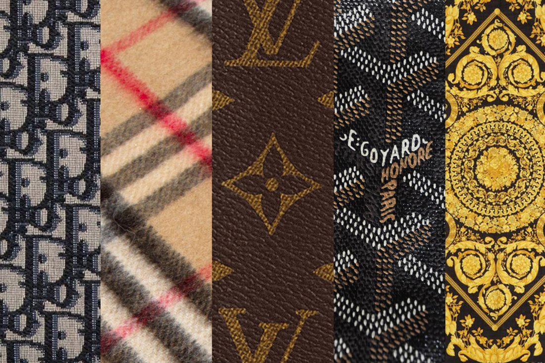
Some prints are universal, like florals, stripes, polka dots and animal skins. Probably every brand has launched a collection with these prints at some point. However, not all prints are shared, and only a few live on to be synonymous with and exclusive to a specific brand.
These are the prints that tell us what brand you’re wearing without telling us what brand you’re wearing (unlike the logomania trend that simply spells it out). If the Burberry check, Louis Vuitton monogram or Versace Barocco print comes to mind, then you have a good idea of what we’re talking about.
Here are the most iconic prints from the top fashion houses and how they came to achieve a cult following.
Louis Vuitton Monogram
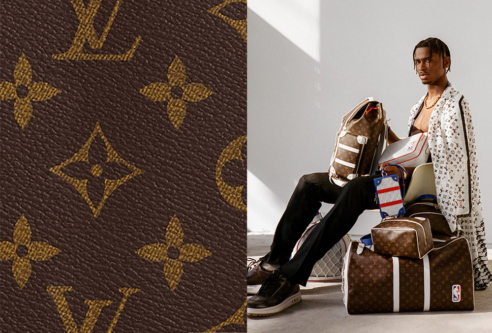
Instantly recognisable anywhere, the Louis Vuitton Monogram is one of the oldest and most iconic fashion prints of all time. It was the founder’s son, Georges Vuitton, who designed the monogram canvas in 1896 as a tribute to his late father. The interlocking L and V initials were created to preserve his father’s legacy and stop counterfeiters from mimicking the brand’s designs, whilst the four-point flowers are said to be lucky motifs inspired by Japanese and oriental designs. Over the years, the canvas has been interpreted across the Maison’s famous trunks, bags, clothing and accessories – reflecting its timelessness and heritage.
Burberry Check
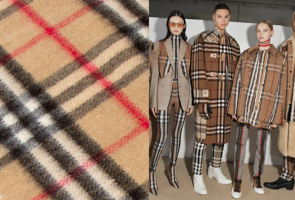
Burberry’s trademark check pattern first surfaced in the late 1910s before it was officially trademarked in 1921. Defined by a beige background with black, white and red intersecting stripes, the pattern lined the interiors of the Burberry garbadine trenchcoat and consequently rode on its fame. Thomas Burberry then used the pattern on scarves and umbrellas from 1967, associating the brand with Britain’s upper class. This caught the attention of the royal family, earning multiple royal warrants and establishing the brand as a heritage British house. Today, the Burberry check can be seen across the brand’s ready-to-wear clothing, bags, shoes and accessories.
Gucci GG canvas
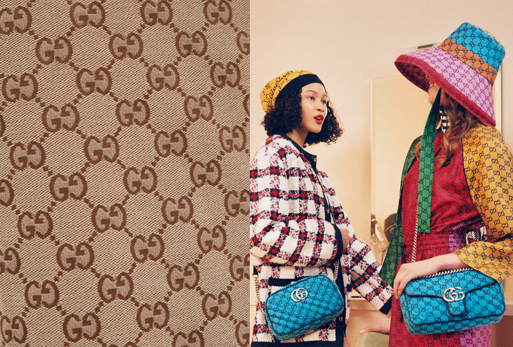
When Guccio Gucci first introduced canvas to his collections, it featured a diamond pattern without any logo. This came to be known as the Gucci Diamante. Later on in 1964, Aldo Gucci added the double G logo to close the corners and thus, the GG canvas was born. Since then, the canvas has seen many reiterations, at times combined with the house’s equally distinguishable green-red-green ribbon and/or floral motifs; other times appearing in different colourways from the original sand-coloured canvas.
Goyardine canvas
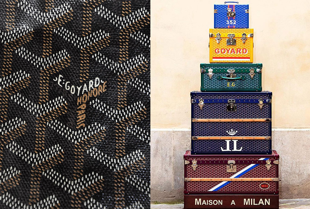
Despite maintaining a relatively low profile as a luxury trunkmaker, Goyard’s namesake canvas is easily recognised by discerning clients. In 1892, after Edmond Goyard succeeded his father at the helm of the house, he introduced the Goyardine canvas, which blends linen and cloth and looks similar to leather. The dots on the canvas create three adjacent chevrons that form the letter “Y” – representing the central letter in the family name and paying tribute to their heritage. The original canvases were all originally hand-painted, until modern technology was applied to the process. Aside from its famous trunks, the Goyardine canvas adorns the brand’s four product lines: travel goods, bags and accessories, special orders and pet accessories.
Related: This luxury brand is a status symbol for the rich – and you may not have heard of it
Dior Oblique
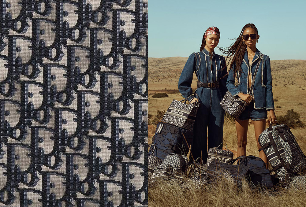
To be fair, Dior’s signature canvas makes its branding clear, but that isn’t the only reason for its iconic status. The jacquard canvas dates back to 1967, during Marc Bohan’s reign as artistic director. It first appeared on one of the bags on the designer’s haute couture collection, before taking over the house’s luggage collection in 1971. By September 1974, the canvas had carpeted the floors and steps of the Dior Monsieur store. John Galliano continued to popularise the Oblique by creating full-blown looks with the canvas in his era. Dior’s current creative director, Maria Grazia Chiuri, has since refreshed the graphic motif with slightly larger lettering and new colourways for a more modern appeal.
Versace Barocco
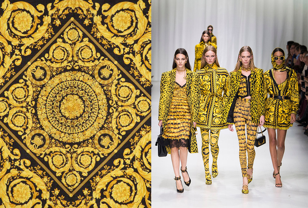
It’s hard to choose only one iconic print from a house that thrives on so many, but if we have to decide on a brand signifier for Versace, it has to be the Barocco. Baroque’s fashion renaissance is said to have started in the late ‘80s, and Gianni Versace introduced the Barocco print not long after for his Spring/Summer 1992 collection. The elaborate iconography and colour palette of the historical period soon became part of the brand’s lexicon, typifying its love of flashy designs and extravagance. The print still decorates the brand’s designs today, spanning from clothing and accessories to furniture and tableware.
Fendi Double F
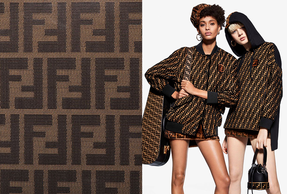
Fendi’s monogram led the comeback of logomania circa 2018, but the double F logo debuted long before the trend surfaced and will likely last long after it passes. Designed in less than 5 seconds by the late Karl Lagerfeld in 1965, the emblem was initially intended for use on the prints and silks that line fur coats (the initials stood for “Fun Fur”). Due to its popularity, the monogram print has been reworked into just about anything the brand makes, even after Silvia Venturini Fendi took over creative reins. Aside from the original tobacco and black palette, it is also often presented in black and white.
Photos courtesy of respective brands


