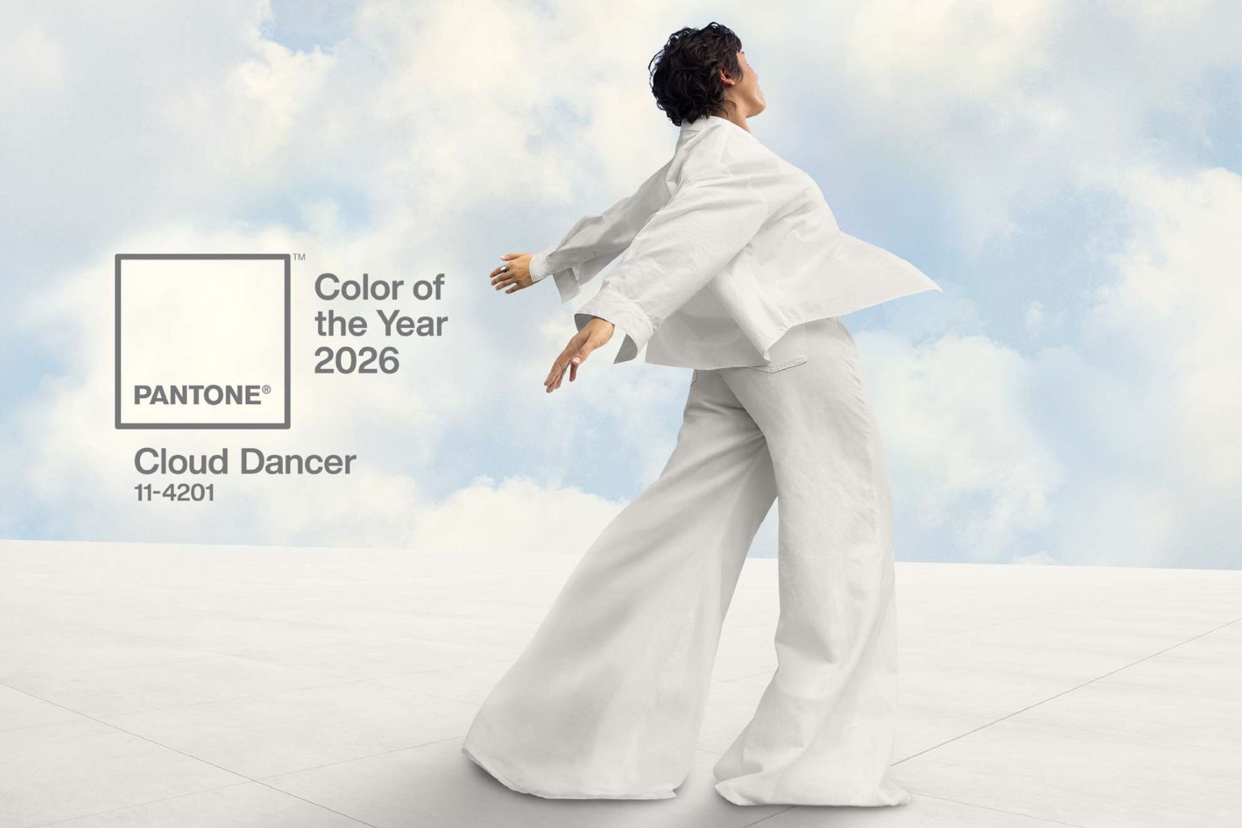


Pantone recently revealed its Colour of the Year for 2026, and the institute’s choice has raised eyebrows and left the audience feeling sceptical. The shade is called ‘Cloud Dancer’, a “lofty white neutral whose aerated presence acts as a whisper of calm and peace in a noisy world,” as described by Pantone on Instagram.
First things first, what is Pantone’s Colour of the Year, and why is it such a big deal? The answer is simple – it is an annual initiative by Pantone, which debuted in 1999, with a goal of engaging fellow design communities in a conversation about colour. This year marks the company’s first time crowning a white shade for the title. However, their vision remains strong: to choose a hue that imbues serenity and invites true relaxation, allowing the mind to wander and creativity to breathe.
Behind the huffing and puffing on the internet, underneath it all lies a bigger question – what does Cloud Dancer, Pantone’s Colour of the Year for 2026, mean for fashion?
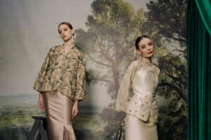
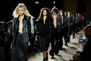
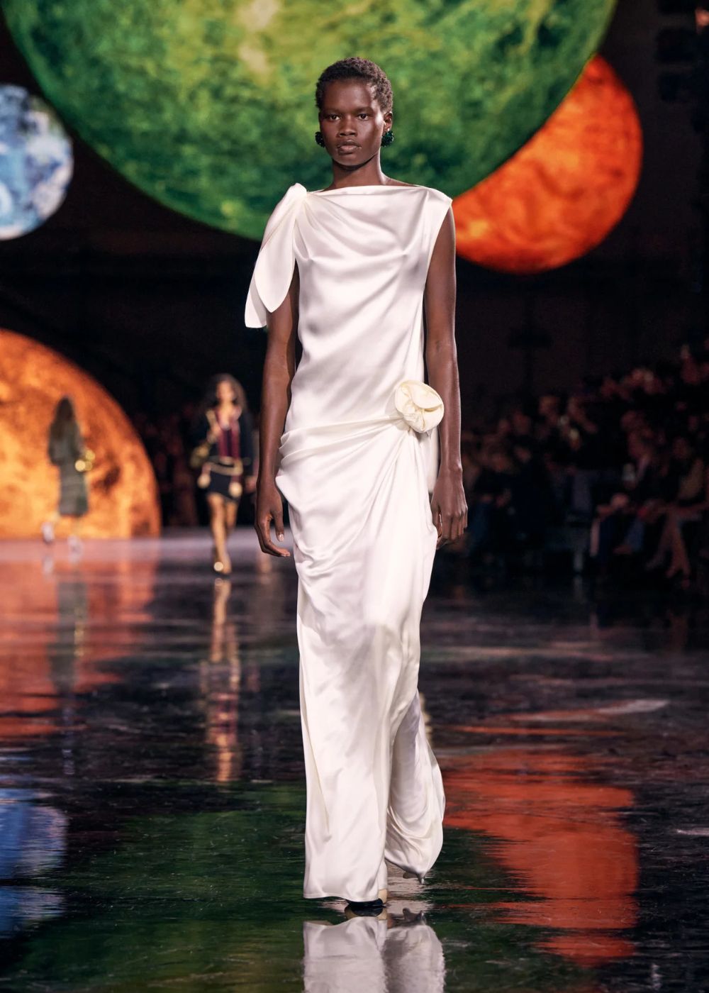
White on Spring/Summer 2026 runways
View this post on Instagram
Truth be told, Pantone’s pick should not have come as much of a surprise for fashion lovers. There’s data showing an increase in white as a colour trend, notably skyrocketing by 156 per cent in Spring/Summer 2026 collections, in comparison to Spring/Summer 2025. Fashion houses and brands like Chanel, Coach, and Bottega Veneta contributed to the data, showcasing hints of all-white looks in their recent shows.
Fashion recession indicators
For the unfamiliar, a recession indicator refers to a sign that might be hinting at an economic decline. Interestingly, the fashion industry can be one of the easiest places to spot recession indicators. Lipstick is the perfect example for this, as it has a lower price point and it’s easier to sell, even during a tough economic period.
Meanwhile, other common fashion recession indicators are white tank tops, tailored silhouettes, and the indie sleaze aesthetic. Coincidentally enough, it seems like all the ingredients for common recession indicators seem to be on trend for 2026. Here’s where it gets interesting – although Pantone’s choice for Colour of the Year 2026 has sparked debate, we think that their decision matches the current state of the fashion industry.
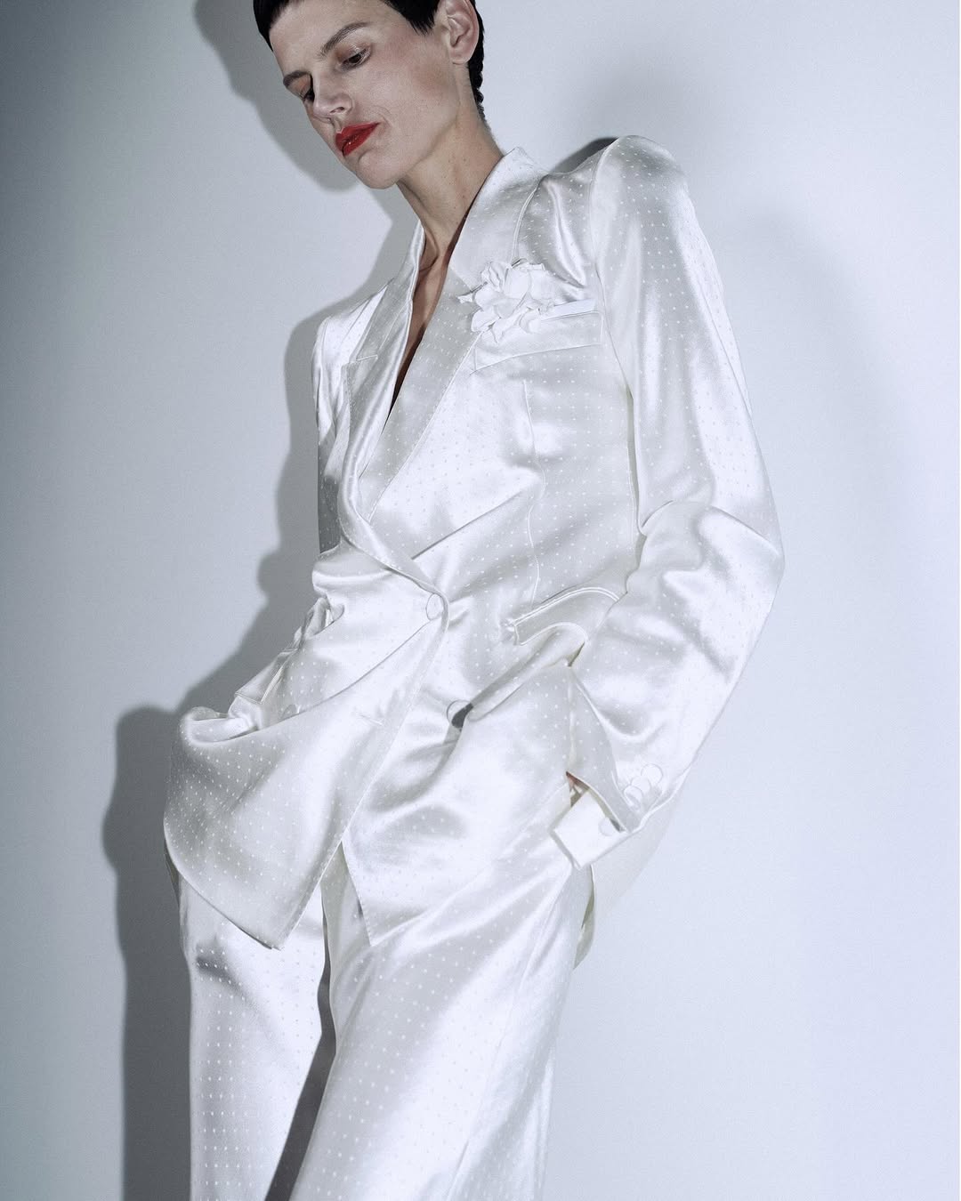
A blank slate
Cloud Dancer, a minimal and effortless hue that Pantone described as a “blank slate”, has proved to align with all the fashion events we’ve seen this year – from debut collections to fashion themes. For example, this season brings countless creative director debuts, including Jonathan Anderson for Dior and Matthieu Blazy for Chanel, where white dominates the runway. Meanwhile, Alessandro Michele’s first work for Valentino also opted for the theme of bliss and escapism. Meanwhile, brands like Acne Studios, Tom Ford, and Stella McCartney focus on tailored pieces, offering simpler and more versatile designs.
Sure, maybe it’s not that deep. White can be for spring the same way floral prints are for spring – a much-needed bright touch after the cold and dark winter days. But perhaps, the new creative directors, fashion brands – and Pantone even – are only backing up momentarily before shifting gears to the next exciting phase up their sleeves – like an inertia before drifting ahead. Whatever the reason, one thing’s for sure. Pantone’s goal in engaging the design communities in a conversation about colour? It might have just been achieved.
For more Colour of the Year articles, read here.