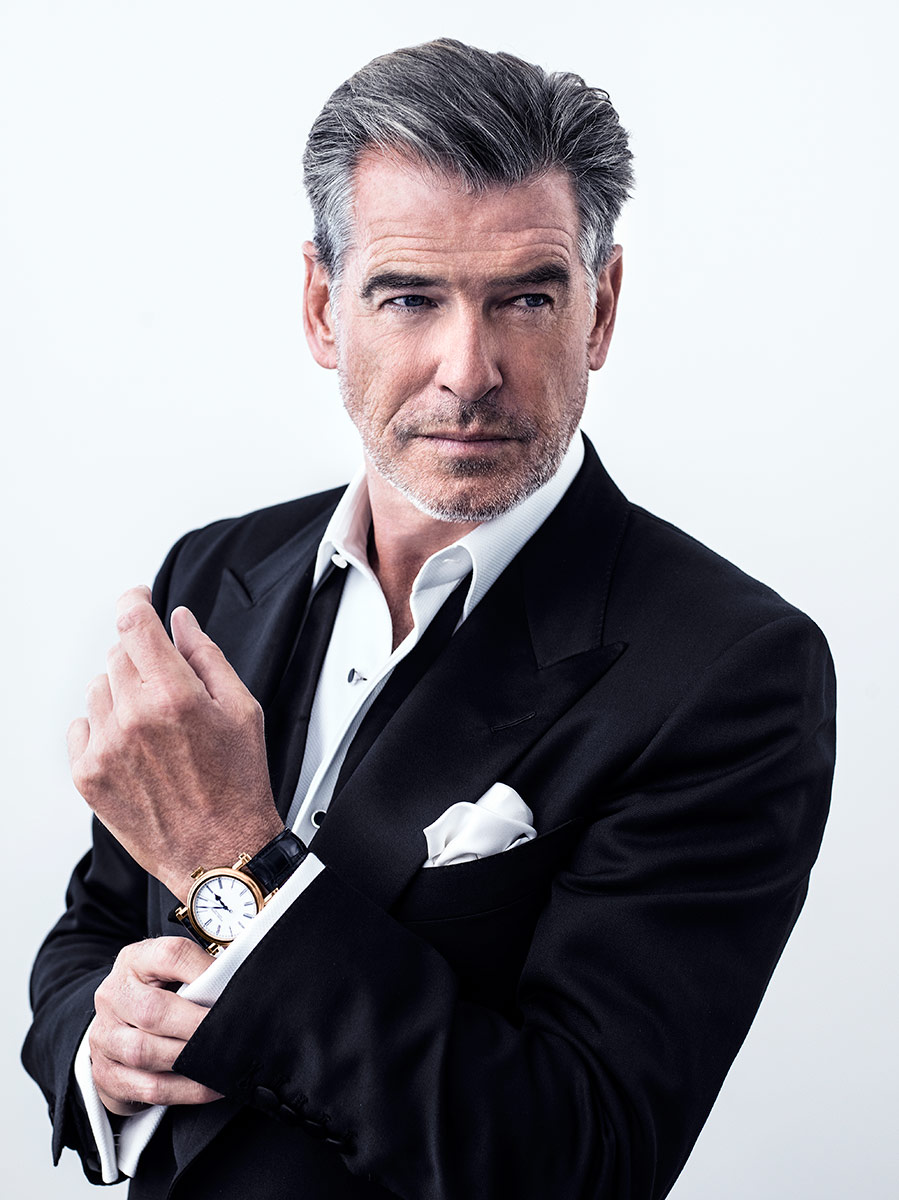
The brand has had the honour of Pierce Brosnan as its worldwide ambassador, but Speake-Marin strives to be more than a pretty face, tells founderPeter Speake-Marin

Tell us about this special place called the Cabinet des Mystères.
There are three collections: the Spirit which is more associated with early military and pilot watches; the J-class is about classic, elegant watches and the Cabinet des Mystères is esoteric – they can be miniatures, commissions or pieces that are linked to different cultures – and within the Cabinet des Mystères is where we have the Skull pieces. I have been making them for nearly 10 years and the motivation has always been associated with momento mori, the value of time.
Why the skulls element?
The focus of the watch is the same as I’ve made before, that is reflections of passing time because the two skulls are looking at each other. Then, the reasons for the baguette diamonds around the dial is a cliché that diamonds are forever, so death is also forever. They represent infinite things, so the association between the skulls and the diamonds is meant to be congruent as a message. If you also consider the way the watch was made, they were also meant to last forever. So put them all together and you get a congruent package.

Were you trying to convey a different message with the Skull Face to Face Tourbillon in comparison to the Silver Skull?
It’s not ‘spruced up’, per se. I wanted make one of a different level because the others were under CHS50,000 and I’d always wanted to combine the tourbillon as the tourbillon cage had a very gothic look to it. That always complimented the gothic aspect of the skulls, so if you’d put the two together, automatically you’d have an expensive watch. It started off without diamonds, and along the way the thought of it convinced me that it would add a nice angle to it, hence the said bezel.
Explain the association that the J-Class collection – which includes the Resilience and Velsheda – has with the America’s Cup.
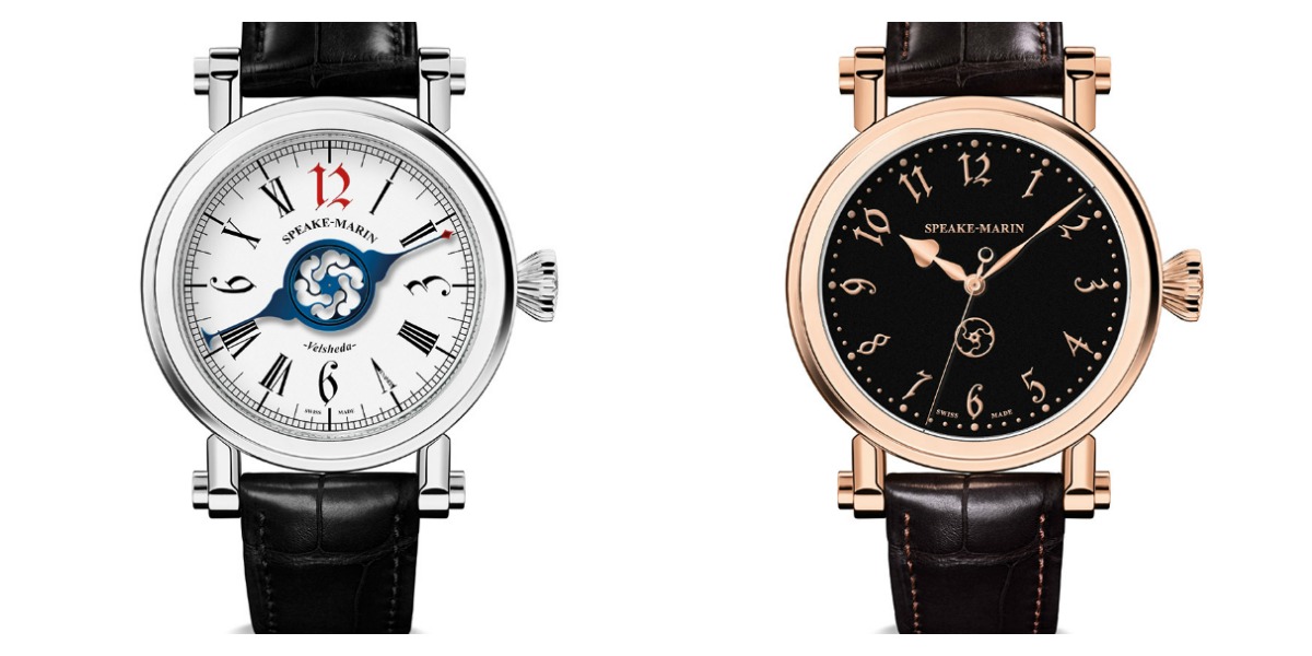
I developed three collections and the Spirit was always about the human spirit concept, hence the name; the J-class needed to have a banner of its own and was always motivated by marine chronometry, classic watchmaking. Marine chronometry was about navigation and that was associated with sailing, so the concept was to link it to yachting and navigation at the same time. It was all about the sea and certain watches like the Velsheda was an actual name for a yacht, so the whole thing was a complete story.
What was your inspiration for Velsheda’s indicators and the wheels? It’s so simple yet unthought-of.
It’s such an original idea that’s why it’s selling so well, and also because it’s something that no one has seen before. I think, like a lot of brilliant ideas, it’s not about the person behind it who is brilliant.
The other Resilience models are clearly in white, so why change it to black?
I’ve done hundreds of designs but most of them are influenced through an esoteric, philosophical look or a very classical pocket watch/marine chronometer look. So I wanted something that was dress-orientated, a little more like a tuxedo watch and elegant without it being ‘bling’. The Black Dial Resilience not only came across like a vintage wristwatch but it was more similar to the type that I would restore from the 1940s, which was a rare case. It gave a deeper inner sense to the collection and since then, my goal has been directed to make more and more unique, different pieces.
The numeral font type on it is really interesting.
I wanted to make a gothic style piece because I think my style is gothic, in general. If you’d look at the bridges, the bridge form and the logo, they all have long curves and sharp points. So, for me, that’s associated to something that could fit very well in Gotham City or something like the Addams family house.
In your opinion, what does the Black Dial Resilience speak of?
It’s a beautiful timepiece that is inspired by early vintage wristwatches.
